
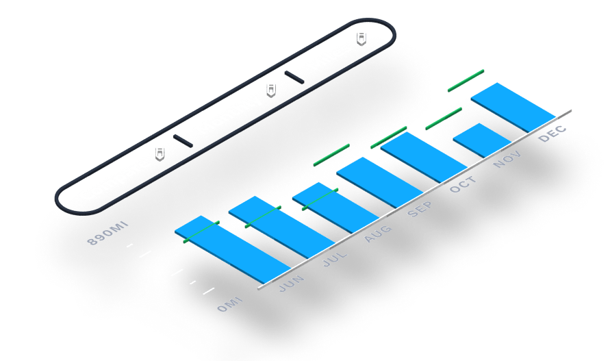
Use your Range Added vs. Used report to gain insights into trends over time as you charge and drive.
This report shows you an easy visual comparison of your range added while charging versus your range used while driving.
Read on to learn more, including how to access detailed information on your usage efficiency.
Accessing your report
To access your Range Added vs. Used report:

Customize your view
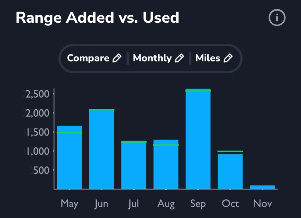
You have the option to choose the view of your report by toggling options for three components:
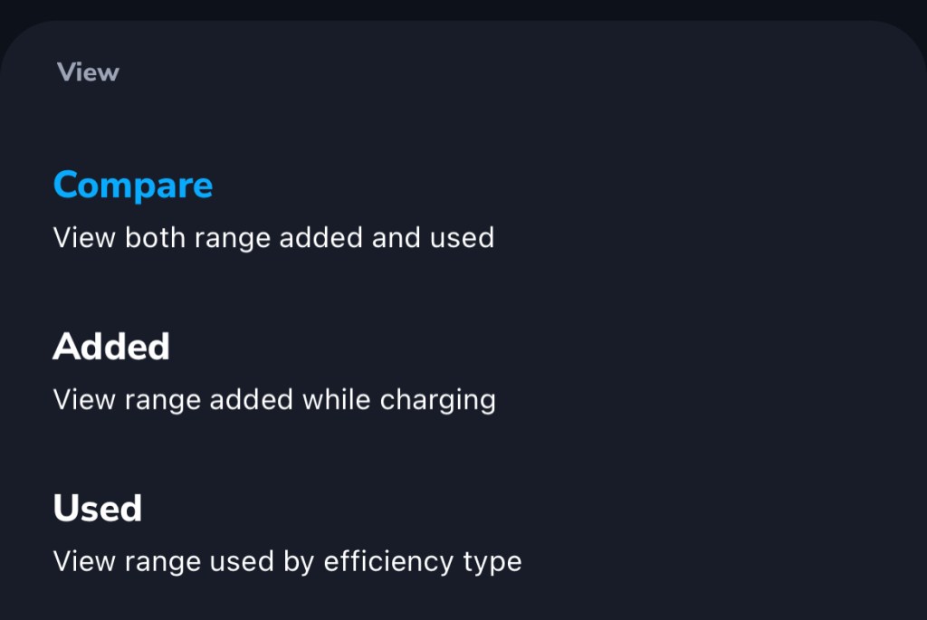
View “Added” or “Used” (or both)
Stick with “Compare” mode to view both range added while charging, and range used.
Select a time window
See your report over the last couple of days, or extend it to compare weeks or months.

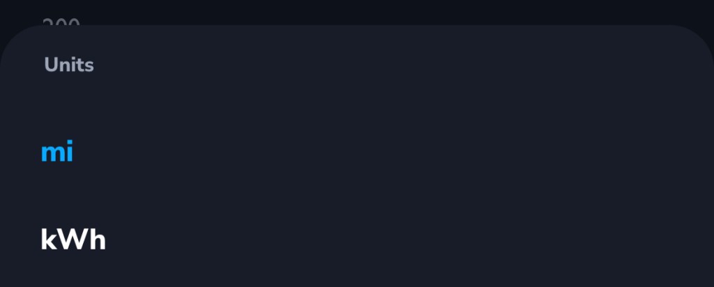
Choose miles or kWh
Adjust units to fit your understanding.
Show range used by efficiency
Want to see a breakdown of your range used based on efficiency level?
If you choose the range “Used” view (instead of “Compare” or “Added), your report will show range used by efficiency type, including idle time.
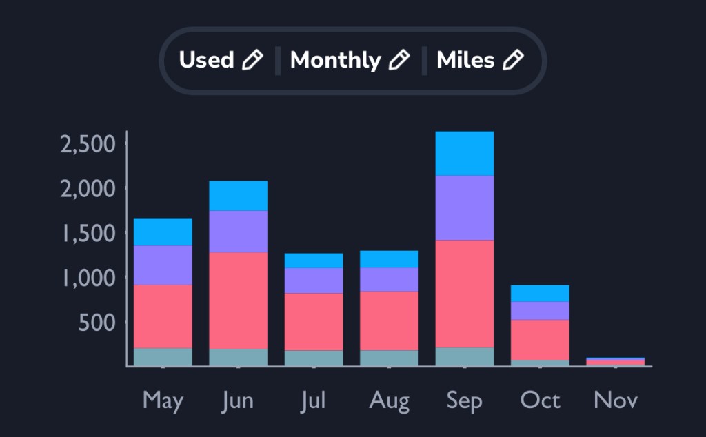
The blue parts of the bar graph show range used at the highest efficiency (greater than, or equal to, 90%).
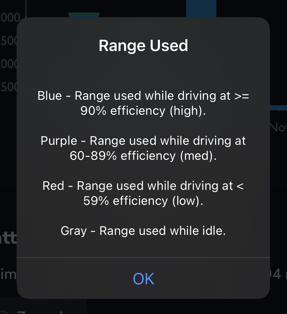
The purple and red parts of the bar graph show range used at medium (60-89%) and low (less than 59%) efficiency, respectively.
The gray parts of the bar graph show range used while the vehicle was in idle mode.
Download TezLab, and subscribe to TezLab Pro for full access to Pro features, including a comprehensive view of how you charge and use your battery.

Leave a comment